The matplotlib widget
There are two main components for the widget. On top is a QWidget which can be added to Qt applications. This widget is capable of displaying different types of plots, which are implemented separately.
Main Widget
The MatplotWidget is a Qt Widget which can be inserted into Qt Applications. It can generate different kinds
of plots, and all the plots should implement tooltips and context menus for the data shown. Also it should be possible
to highlight specific data-points inside each plot.
-
class
MatplotWidget(parent=None, dpi=100, initial_message=None)[source]¶ A Matplotlib Qt Widget capable of drawing different kinds of plots
It emits the following signals
- point_picked (str) : When the user clicks on a point in the plot
- context_requested (str) : When the user right clicks on a point
Both of them include the id of the clicked point.
-
draw_bars(data, ylims=None, orientation='vertical', group_labels=None)[source]¶ Draws a bar chart
Parameters: - data (pandas.DataFrame) – Data frame to draw, the first column will be the height of the bars, the optional second column will be used to group data
- ylims (tuple) – minimum and maximum y axis values
- orientation (str) – Orientation of the bars, can be “vertical” or “horizontal”
- group_labels (dict) – Optioina, dictionary with group labels
-
draw_boxplot()[source]¶ Draw a boxplot to illustrate anova results in the matplot widget, not yet implemented
-
draw_coefficients_plot(coefficients_df, draw_intecept=False)[source]¶ Draws a coefficient plot to show the results of a linear regression
Parameters: - coefficients_df (pandas.DataFrame) – DataFrame containing the 95% confidence interval as CI_95, the standard error (Std_error), Slope, and indexed by coefficient names.
- draw_intecept (bool) – if
Truethe intercept coefficient (first in the DataFrame) will be draw otherwise it will be ignored.
-
draw_intercept(data, y_name, groups=None, ylabel=None, ci_plot=True, color=None, group_labels=None)[source]¶ Draws a plot to show the mean of different data groups
Parameters: - data (pandas.DataFrame) – DataFrame with numerical data
- y_name (str) – data column containing the y axis data
- groups (str) – optional, column containing group numerical labels
- ci_plot (bool) – if
Truedraw a confidence interval - color (tuple) – Optional, color to use for the plot
- group_labels (dict) – Optional, labels for the different groups
-
draw_message(message)[source]¶ Draws a message on the widget
Parameters: message (str) – Message to display
-
draw_residuals(residuals, fitted, names=None)[source]¶ Creates two plot which can be used to diagnose the residuals of a distribution.
- An scatter plot of residuals vs predicted outcome variable
- A histogram of residuals
Parameters: - residuals (numpy.ndarray) – Array of residuals
- fitted (numpy.ndarray) – Array of fitted values
- names (list) – Names to display as tooltips for each point
-
draw_scatter(data, x_name, y_name, xlabel=None, ylabel=None, reg_line=True, hue_var=None, hue_labels=None, qualitative_map=True, x_labels=None)[source]¶ Draws a scatter plot
Parameters: - data (pandas.DataFrame) – DataFrame with numerical data
- x_name (str) – Name of the column containing the data for the x axis
- y_name (str) – Name of the column containing the data for the y axis
- x_label (str) – Optional, label for the x axis, if not given x_name will be used
- y_label (str) – Optional, label for the y axis, if not given y_name will be used
- reg_line (bool) – If
Truedraw a line showing a linear regression between the two variables - hue_var (str) – Optional, Name of the column containing the data for the color
- hue_labels (dict) – Optional, Labels to use for each level of the hue_var
- qualitative_map (bool) – If
Trueuse a qualitative color map, otherwise use a sequential color map - x_labels (dict) – Optional, specify positions and values for tickmarks in the x axis
Example
This simple Qt Application illustrates the use of the MatplotWidget. You can view the full script
here.
The first part of the scripts import the required libraries and creates a simple Qt Frame we will use for testing
from PyQt4 import QtGui
import numpy as np
import pandas as pd
from braviz.visualization import matplotlib_qt_widget
class TestFrame(QtGui.QFrame):
def __init__(self):
QtGui.QFrame.__init__(self)
layout = QtGui.QVBoxLayout()
self.setLayout(layout)
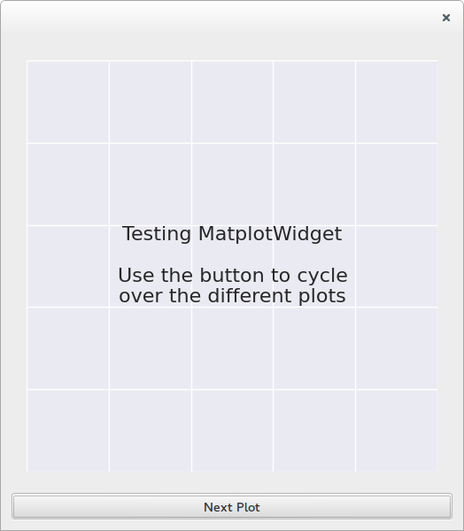
msg = "Testing MatplotWidget\n\nUse the button to cycle\nover the different plots"
self.plot_widget = matplotlib_qt_widget.MatplotWidget(self, initial_message=msg)
button = QtGui.QPushButton("Next Plot")
button.clicked.connect(self.draw_next)
layout.addWidget(self.plot_widget)
layout.addWidget(button)
self.current_plot = -1
self.plot_funcs = ["draw_bars", "draw_group_bars",
"draw_coefficients_plot", "draw_scatter",
"draw_color_scatter", "draw_intercept",
"draw_residuals", "draw_message"]
def draw_next(self):
self.current_plot = (self.current_plot + 1) % len(self.plot_funcs)
func_name = self.plot_funcs[self.current_plot]
func = getattr(self, func_name)
func()
And the last lines create the widget and starts the Qt events loop
if __name__ == "__main__":
    app = QtGui.QApplication([])
    frame = TestFrame()
    frame.show()
    app.exec_()
Running just the above fragments will create the following window
Clicking on the button will call the methods inside self.plot_funcs consecutively. Each of this methods illustrate
a type of plot.
Bar plots
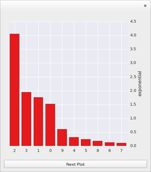
First lets draw a simple bar plot.
    def draw_bars(self):
        data = np.random.standard_exponential(10)
        df = pd.DataFrame({"exponential": data})
        self.plot_widget.draw_bars(df)
And now lets try a bar plot with groups data
    def draw_group_bars(self):
        data = np.random.standard_exponential(10)
        groups = np.random.random_integers(0, 3, 10)
        df = pd.DataFrame({"exponential": data, "groups": groups})
        self.plot_widget.draw_bars(df, orientation="horizontal")
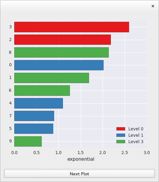
Try hovering the mouse over the bars.
Coefficients plot
The coefficients data frame would normally come from fitting a linear model, but for this example we are going to generate it artificially.
    def draw_coefficients_plot(self):
        centers = np.random.randn(10)
        std_errors = np.abs(np.random.randn(10))*2+0.2
        ci95_width = np.random.uniform(1, 2, size=10) * std_errors
        ci95 = [(c - w, c + w) for c, w in zip(centers, ci95_width)]
        names = ["(intecept)"]+ ["coef_%d" % i for i in xrange(1,10)]
        df = pd.DataFrame({"CI_95": ci95, "Std_error": std_errors, "Slope": centers},
                          index=names)
        self.plot_widget.draw_coefficients_plot(df)
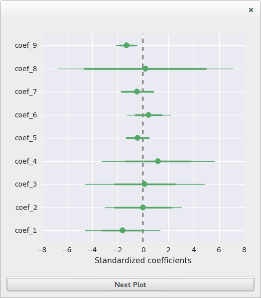
In this example the only coefficient that appears to be significant is number nine.
Also notice there is no (intercept) in the plot.
Scatter plots
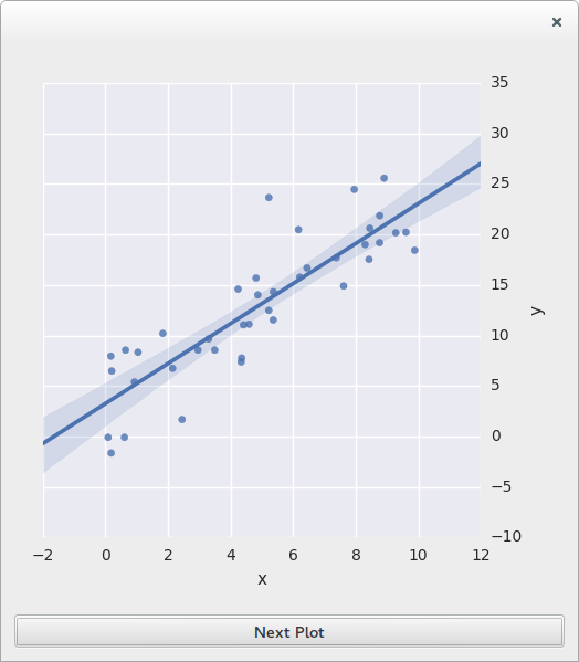
First a simple case
    def draw_scatter(self):
        noise = np.random.randn(40) * 4
        x = np.random.uniform(0, 10, 40)
        y = 2 * x + 3 + noise
        df = pd.DataFrame({"x": x, "y": y})
        self.plot_widget.draw_scatter(df, "x", "y")
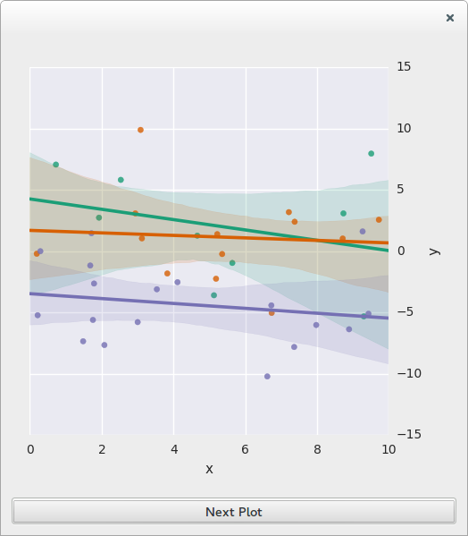
And now lets add groups
    def draw_color_scatter(self):
        noise = np.random.randn(40) * 4
        x = np.random.uniform(0, 10, 40)
        groups = np.random.randint(1, 4, 40)
        y = -2 * groups + 3 + noise
        df = pd.DataFrame({"x": x, "y": y, "groups": groups})
        self.plot_widget.draw_scatter(df, "x", "y", hue_var="groups")
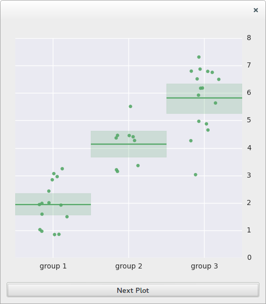
Intercept plot
    def draw_intercept(self):
        noise = np.random.randn(40)
        groups = np.random.randint(1,4,40)
        group_labels = dict([(k,"group %d"%k) for k in xrange(1,4)])
        data = groups*2 + noise
        df = pd.DataFrame({"data" : data, "groups" : groups})
        self.plot_widget.draw_intercept(df,"data","groups",group_labels=group_labels)
Residuals plot
Lets look at some artificial residuals
    def draw_residuals(self):
        residuals = np.random.randn(40)
        fitted = np.random.uniform(0,5,40)
        self.plot_widget.draw_residuals(residuals,fitted)
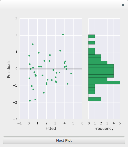
In the example the histogram appears to be skewed, while there appears to be a trend in the scatter plot, this may indicate that we missed a regressor in the model.
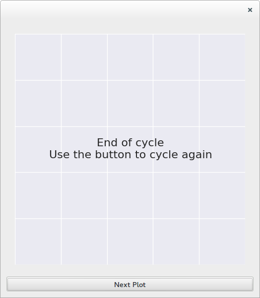
Message plot
And finally back to a message plot
    def draw_message(self):
        msg = "End of cycle\nUse the button to cycle again"
        self.plot_widget.draw_message(msg)
Plot classes
Notice that this classes are usually used through :class:MatplotWidget . These classes are usually not used directly, however they may be useful if you want to create additional plot types.
All plots should be subclasses of the abstract class
-
class
AbstractPlot[source]¶ Base class for plots used inside the
MatplotWidget-
add_subjects(subjs)[source]¶ Should highlight the specified points in the plot
Parameters: subjs (list) – List of subjects to highlight
-
get_last_id()[source]¶ Get the id of the point last signaled with the cursor. This is used by the MatplotWidget to create a context menu
Returns: Id of the last point for which a tooltip was requested
-
get_tooltip(event)[source]¶ Request a tooltip at a given position
Return an empty string if there is no tooltip for that position
Parameters: event (matplotlib.backend_bases.MouseEvent) – Matplotlib MouseEvent that caused the request, extract the position from here Returns: string to show as tooltip, empty string if you don’t want to show anything
-
The currently available plots are
-
class
MessagePlot(axes, message)[source]¶ Draws a text message into a
MatplotWidgetTo create this plot call
MatplotWidget.draw_scatter
-
class
MatplotBarPlot(axes, data, ylims=None, orientation='vertical', group_labels=None)[source]¶ Draws a bar plot on the
MatplotWidget.Bars are sorted from smallest to biggest, they also may be colored with respect to a nominal variable. To create a bar plot call
MatplotWidget.draw_bars()
-
class
ScatterPlot(axes, data, x_var, y_var, xlabel=None, ylabel=None, reg_line=True, hue_var=None, hue_labels=None, qualitative_map=True, x_ticks=None)[source]¶ Draws an scatter plot in
MatplotWidget.The plot may contain
- a line showing regression results
- data from different groups painted with different colors
To create this plot call
MatplotWidget.draw_scatter
-
class
ResidualsDiagnosticPlot(figure, residuals, fitted, names=None)[source]¶ Creates two plots to analyze distributions of residuals from a regression.
The first one shows the distribution of the residuals with respect to the outcome variable. This should be used to check the hypothesis that the variance must be constant across this range.
The second one shows a histogram of the residuals. This should be used to verify that the residuals distribution is close to normal.
To create this plot call
MatplotWidget.draw_residuals
-
class
InterceptPlot(axes, data, y_var, groups=None, y_label=None, ci_plot=True, color=None, group_labels=None)[source]¶ Draws a plot to show the mean of different data groups
Optionally a confidence interval can be added. To create this plot call
MatplotWidget.draw_intercept
-
class
CoefficientsPlot(axes, coefs_df, draw_intercept=False)[source]¶ Draws a coefficient plot to illustrate the results of a linear regression.
The plot shows the 95% confidence intervals and standard errors. For a coefficient to be significant it’s confidence intervals should not cross the zero line. For it to have an important effect it should be far from the zero.
The input DataFrame should contain the results of a linear regression with normalized variables. The expected columns are
- (index) : Coefficient names
- CI_95 : lower and upper limit of the 95% confidence interval
- Std_error : The standard error magnitude
- Slope : slope of the coefficients in the regression
Also the first row in the dataframe should be the intercept, this will be ignored if intercept is
False.Use
MatplotWidget.draw_coefficients_plot()to draw create this plot.